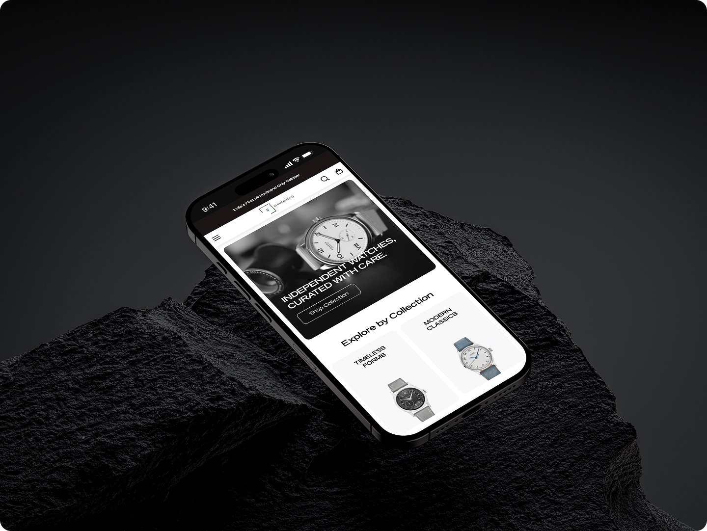
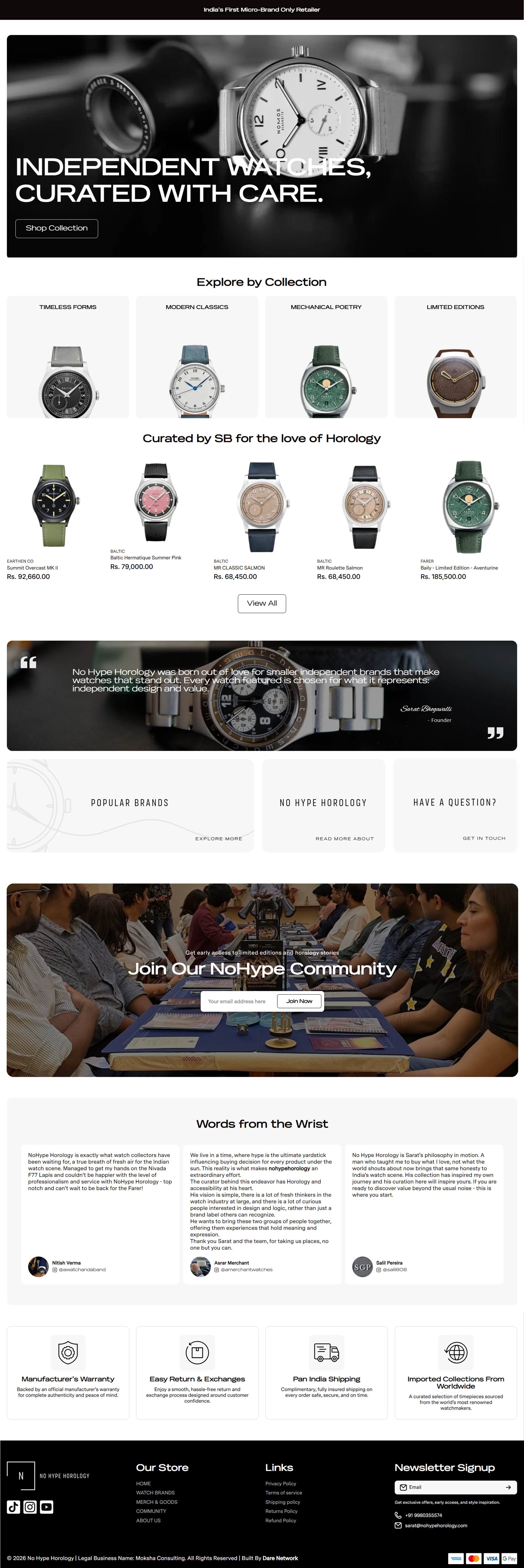
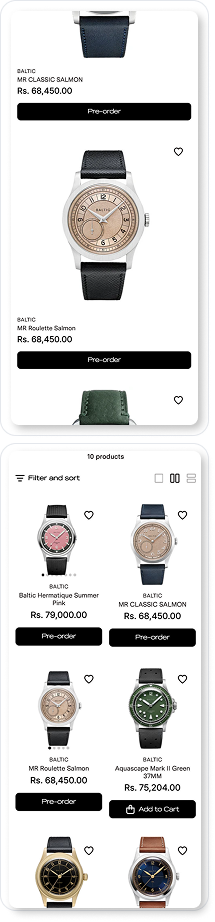
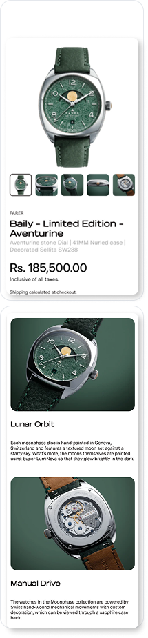
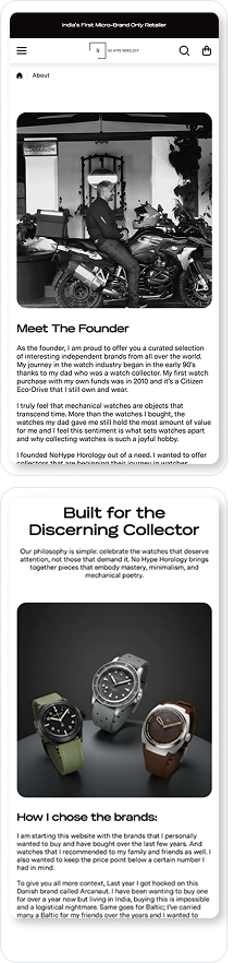
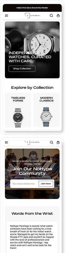
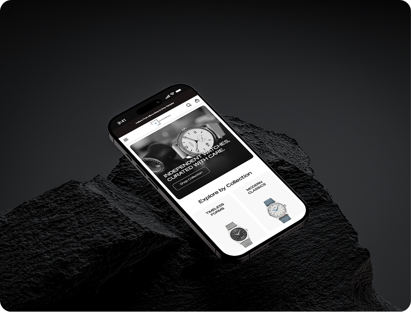
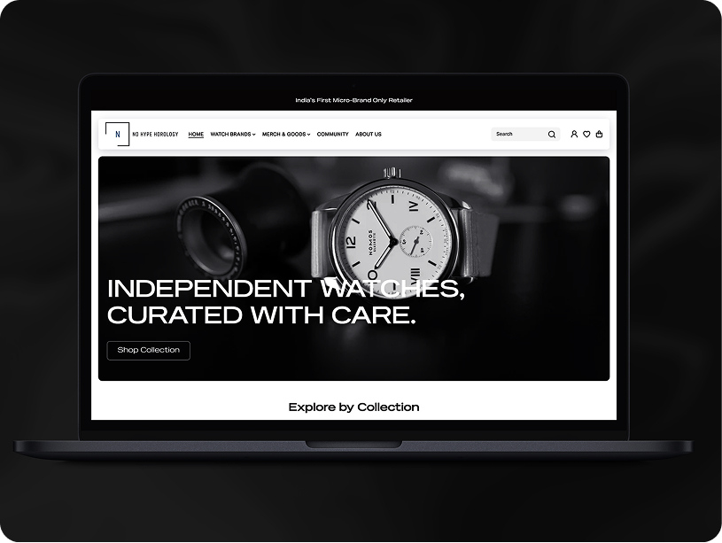
Case Study

No Hype Horology

How We Rebuilt a Kitchenware Website to Make Products Easier to Buy

Industry: Kitchenware and Home EssentialsYear: December 2024Project : Website Design and DevelopmentTimeline : 4 weeks

What We Changed

Phase 1: Clear structure before design

We first reviewed the site as a user's view to understand where people and we are also dropping off. One of the biggest issues was over-categorisation. Too many options upfront made browsing feel tiring and unfocused.

We simplified and regrouped collections so users could browse by everyday use rather than technical product types. This made navigation feel lighter and helped users move through the site with more ease.

Phase 2: Design that supports products, not distracts

We used clean layouts with enough breathing space so products could stand out without feeling lost.

Heavy sliders were replaced with section-based layouts, making content easier to scan and quicker to load. Consistent spacing and simple icon usage helped users understand information at a glance, while product blocks focused on clarity rather than decoration.

From our experience working with kitchenware brands, this approach matters. Trust and practicality influence buying decisions far more than visual drama.

Phase 3: Optimisation and testing

Our tech team focused on improving Core Web Vitals, with particular attention to load time and interaction responsiveness.

They tested the site across mobile and desktop breakpoints to ensure layouts, buttons, and touch targets worked smoothly on all screen sizes. The team also set up product tagging, SEO metadata, and analytics so performance and user behaviour could be tracked accurately after launch.

Phase 4: Speed, trust, and confidence

We removed unnecessary scripts, compressed assets, and kept animations light. Alongside performance, we added subtle trust signals where users needed reassurance, not everywhere.

This included:

  • Clean product photography
  • Clear collection context
  • Testimonials placed close to decision points

Results

These changes were not cosmetic. They reshaped how real users moved through the site.

1.4s
Average homepage load time
42%
Reduction in mobile bounce rate
3.2 pages
Average product browsing depth
64%
Increase in enquiry submissions

,  

Ireka Homes

What stood out to us was how much calmer the experience felt after launch. By simplifying layouts and reducing visual noise, users stayed longer, explored more, and interacted with the site with greater confidence.

At Dare Network, this project reinforced a simple belief. When structure, speed, and clarity come together, even everyday products feel easier to choose and easier to buy.

Explore More

Vismay - Meta & Google Ads

Meta Ads
Google Ads

Ireka Homes Website Revamp

UI / UX
Web Development

Disha Creationz - Meta Ads

Meta Ads
Next
Next

Have a Project in Mind?

Everything you need to plan, build, and scale your digital growth, all in one place

Lets start your growth journey