Case Study
Ireka Homes Website Revamp
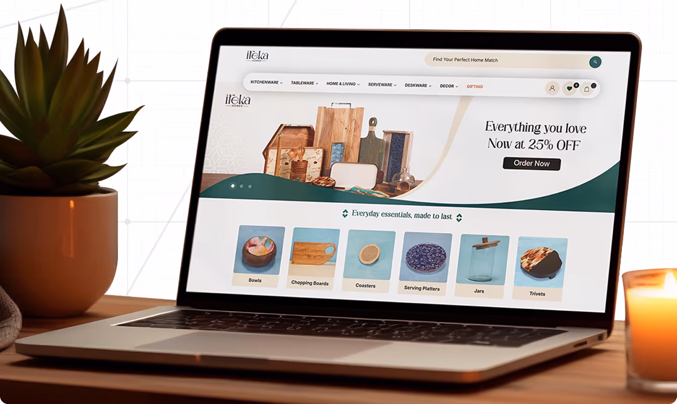
How We Rebuilt a Kitchenware Website to Make Products Easier to Buy
The Challenge
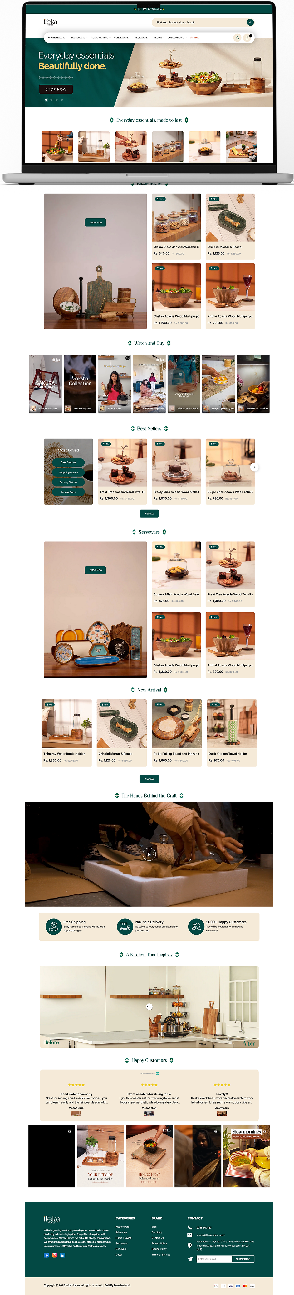
Ireka Homes, a growing D2C kitchenware brand, had well-designed products but a website that did not support them. The existing site made browsing take longer than it should have, missed key CRO opportunities that could have improved both customer experience and sales. And when users spend too much time trying to find clarity, they leave.
When our Dare Network team first reviewed the website from a customer’s point of view, it was hard to understand how collections were organised or how products differed from one another. On mobile, the problems were more visible. This hesitation often led to second thoughts about buying.
What was not working
- Product pages did not highlight use cases or differences clearly
- Navigation felt cluttered, especially on mobile
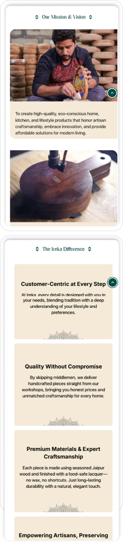
- The brand story was missing, making the site feel transactional rather than considered
- Key actions like Add to Cart and Contact were not clearly
- Performance issues slowed down the browsing experience
Our Strategy
After going through the research, our tech team did not start with visuals. We started by understanding how real people actually use the website. How users move through kitchenware collections, where they slow down, and what causes them to drop off before purchasing.
With a D2C-focused mindset, the goal was to improve the user experience, simplify product discovery, and shape a visual identity that matched Ireka Homes’ modern kitchenware range.


What We Changed
Phase 1: Clear structure before design
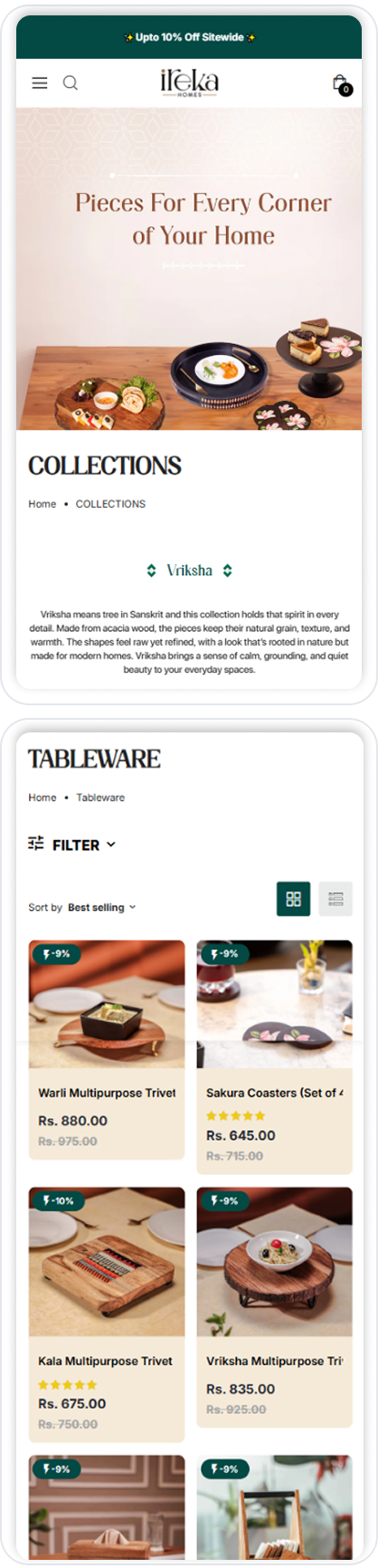
We first reviewed the site as a user's view to understand where people and we are also dropping off. One of the biggest issues was over-categorisation. Too many options upfront made browsing feel tiring and unfocused.
We simplified and regrouped collections so users could browse by everyday use rather than technical product types. This made navigation feel lighter and helped users move through the site with more ease.
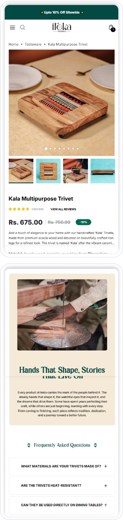
Phase 2: Design that supports products, not distracts
We used clean layouts with enough breathing space so products could stand out without feeling lost.
Heavy sliders were replaced with section-based layouts, making content easier to scan and quicker to load. Consistent spacing and simple icon usage helped users understand information at a glance, while product blocks focused on clarity rather than decoration.
From our experience working with kitchenware brands, this approach matters. Trust and practicality influence buying decisions far more than visual drama.
Phase 3: Optimisation and testing
Our tech team focused on improving Core Web Vitals, with particular attention to load time and interaction responsiveness.
They tested the site across mobile and desktop breakpoints to ensure layouts, buttons, and touch targets worked smoothly on all screen sizes. The team also set up product tagging, SEO metadata, and analytics so performance and user behaviour could be tracked accurately after launch.
Phase 4: Speed, trust, and confidence
We removed unnecessary scripts, compressed assets, and kept animations light. Alongside performance, we added subtle trust signals where users needed reassurance, not everywhere.
This included:
- Clean product photography
- Clear collection context
- Testimonials placed close to decision points
Results
These changes were not cosmetic. They reshaped how real users moved through the site.
—
,
Ireka Homes
What stood out to us was how much calmer the experience felt after launch. By simplifying layouts and reducing visual noise, users stayed longer, explored more, and interacted with the site with greater confidence.
At Dare Network, this project reinforced a simple belief. When structure, speed, and clarity come together, even everyday products feel easier to choose and easier to buy.
View the site in action
.jpg)
.jpg)
.jpg)
.jpg)
Have a Project in Mind?
Everything you need to plan, build, and scale your digital growth, all in one place