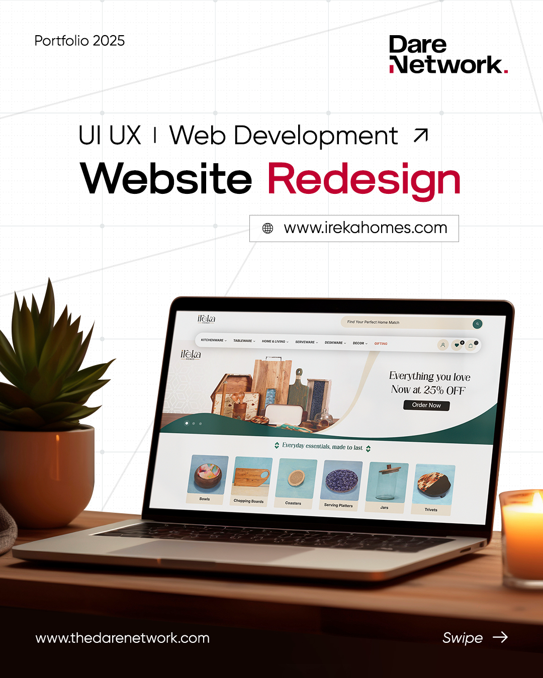
In today's fast-moving digital landscape, a website isn't just a digital brochure – it's your brand's most visible storefront. For Ireka Homes, a homegrown kitchenware brand rooted in functionality and design, their website needed to reflect not just what they sell, but how they make people feel in their homes.
When we first analyzed https://www.google.com/search?q=Ireka-Homes.com, it was clear: the site had heart, but it lacked direction. Navigation was clunky, visuals didn't speak to the brand's evolving identity, and the overall experience didn't match the quality of their product catalog. That's when the redesign began – not just to look better, but to work better.
The Problem with the Old Design
Before the redesign, here's what we noticed:
- Outdated Aesthetic: The site design felt more like a traditional real estate page than a kitchenware brand. It lacked warmth and modern appeal.
- Limited Storytelling: While the products were front and center, there wasn't a clear brand story, emotional hook, or lifestyle-driven experience.
- Clunky Navigation: Browsing felt transactional, not exploratory. Product discovery was difficult without filtering, visual hierarchy, or a proper sitemap.
- Slow Load Times: Performance was an issue – the homepage took over 5 seconds to load on mobile, contributing to a high bounce rate.
The Redesign Vision: Functional, Fresh, Familiar
Our goal was to give Ireka Homes a digital presence that mirrors the care they put into their kitchenware. We wanted every page to feel:
- Minimal but rich in emotion
- Craft-inspired, but digitally modern
- Conversion-focused without being pushy
We started by refining the brand's core: highlighting craftsmanship, everyday elegance, and functional design – and translating that into the website's layout, structure, and visuals.

Key Improvements in the New Design
1. Visual Identity Overhaul
We introduced a fresh visual language – neutral palettes, bold product photography, rounded corners, and lots of white space to let the products breathe. Typography was upgraded for readability and elegance.
2. Homepage That Tells a Story
The homepage now introduces Ireka Homes with a warm visual identity, featured collections, kit bundles, and user testimonials. It doesn't just show products – it tells why they matter.
3. Dedicated Collection Sections
Previously, product categories were buried under a generic shop layout. We introduced clear collection hubs – Gado, Mudgar, Santol, and Vapro – each with its own visual theme and CTA.
4. Faster Load Time, Better Performance
We optimized assets and code to reduce the homepage load time from 5.8 seconds to 1.4 seconds. The mobile experience is now snappy and responsive.
5. Product Discovery and Browsing
By increasing product browsing depth from 1.6 to 3.2 pages/session, the new layout encourages deeper engagement. Features like visual filters, thumbnail previews, and contextual upsells make exploring enjoyable.
6. Emotional Anchors and Trust Builders
We added real customer reviews, certification logos, social proof, and visual storytelling to build trust – especially important for first-time buyers.
Final Thoughts
A good redesign is like a kitchen makeover – it doesn't just look better, it works better. For Ireka Homes, this meant aligning their digital presence with the beauty and functionality of their products. Their stunning new website isn't just an upgrade – it's a transformation.
If your brand is evolving but your website isn't keeping up, it might be time to rethink the design – not just for aesthetics, but for experience.


